Quick Tip: Create Digital Tintype Photos
-------------------------------------------------------------------------------------------------------
Tutorial Details
- Program: Adobe Photoshop
- Difficulty: Beginner
- Estimated Completion Time: 30 Minutes
-------------------------------------------------------------------------------------------------------
Before We Begin
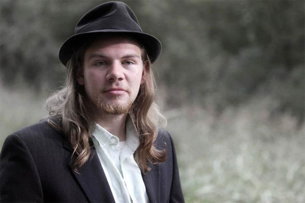
This is the original photo by Aaron Hoegenauer. It is a reference to the time period of tintypes, it just needs a makeover to put it squarely in the past. When you choose a photo, remember that most tintypes were semi-formal portraits, but you can apply these effects to just about anything whether you are attempting to create a true period piece or not.
Step 1
The first step after opening the photo is to add a hue/saturation adjustment layer. By adding the layer instead of editing the photo directly, we are using non-destructive editing.
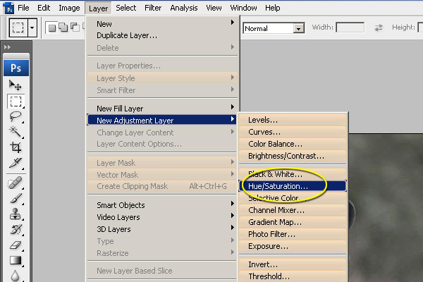
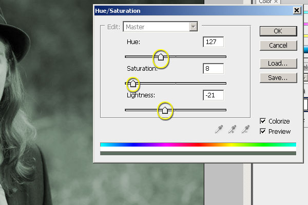
Step 2
There are four things to do in hue and saturation. Check the colorize box to change the photo to a one color image. Next, choose a hue. Although some tintypes are sepia, the aging often brings in interesting color temperatures. I chose a cool blue. Third, desaturate the image almost entirely, leave in a hint of color to keep it away from true black and white. Lastly, use the lightness slider to darken the image a bit. This is the least important step as there are several ways to accomplish it.
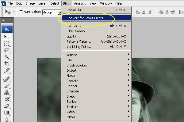
Step 3
Next, we are going to add several blur effects to simulate bad focus and subject movement due to long exposure time. Start by converting the base layer for smart filters.
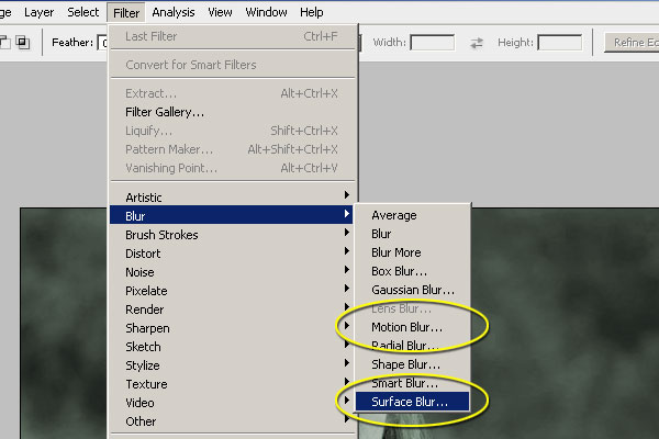
Step 4
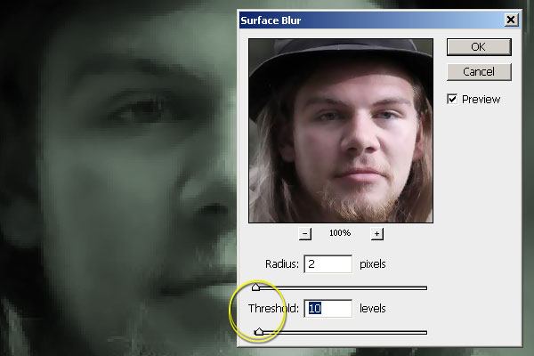
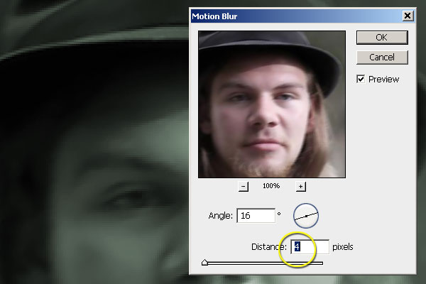
The two effects we will use are a Motion Blur and a Surface Blur.
This is a before blur image for comparison.
The goal of the Surface Blur is to eliminate skin texture and detail. These are missing from most tintype photos and are key to reproducing the period effect.
Step 5
Keep the Motion Blur to a minimum. The angle should be mostly side-to-side. For a more complex edit, try using different levels of blur on different subjects.
Step 6
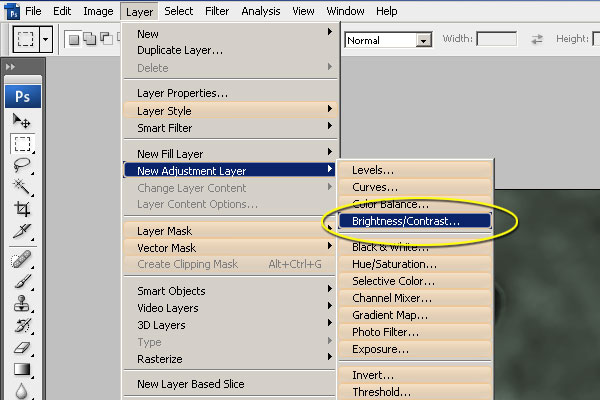
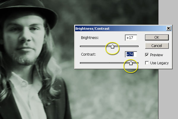
Next we are going to use the brightness/contrast adjustment layer to blow out the highlights and darken the darks.
Adding some brightness will allow you to raise the contrast as high as you want. The goal is to reduce the image almost entirely to two tones: bright and shadow.
Step 7
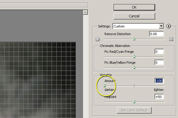
Two more adjustments to go. The first one is a Vignette to darken the corners, found in the Lens Correction dialogue.
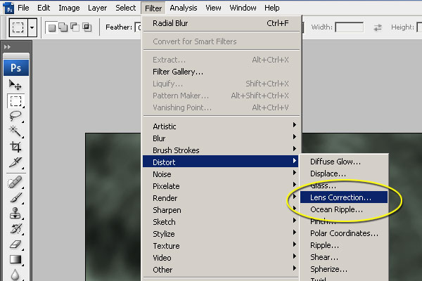
Here, pull the slider all the way to darken the corners.
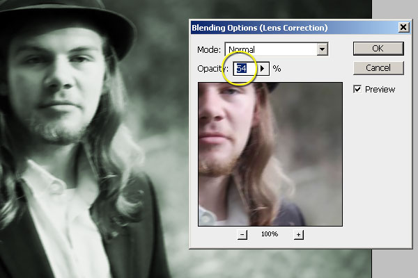
If you need to adjust the intensity, right click on the layer itself and select Options.

I ended up using a medium opacity. Vignetting is very strong in tintypes, so this is probably as light as you would want to go.
Step 8
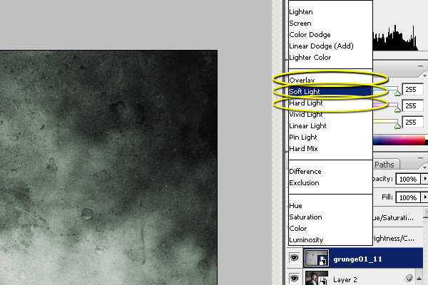
Lastly, we add a texture over the photograph. Concrete textures work as they are a flat surface and have scratches, stains, and pockmarks. I found a free concrete texture pack that you can download from Lost and Taken.
href="http://lostandtaken.com/blog/2009/3/6/14-free-concrete-textures-for-solid-design.html">
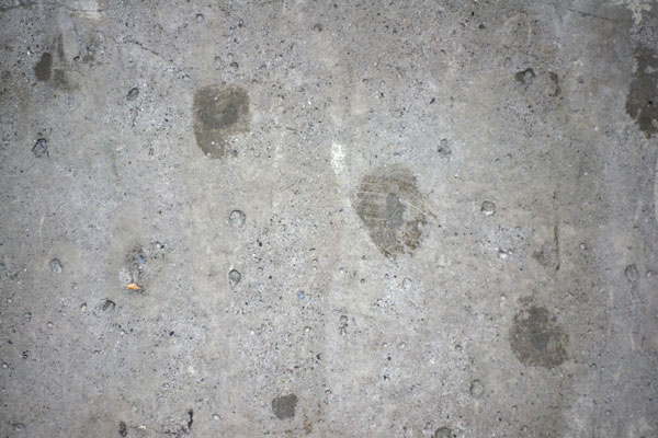
Place the textured image on top of your other layers. Experiment with blending modes to find one that performs well. Overlay typically is a great place to start, but Soft, Hard Light, or Multiply are alternates. Every image reacts differently, so it may take some trial-and-error.
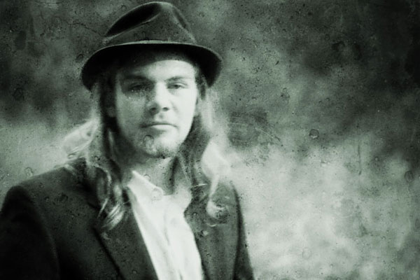
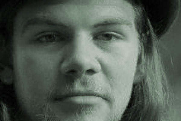
Final Image